Josh Kligman:
We’re going to dive into a few examples that I’ve seen from nonprofits and foundations that used Storyraise Reports to tell their stories.
And now that your end-of-year campaigns are in full swing, it’s a great opportunity for donors to follow some sort of story around the calendar as to how their donations have been spent. The more specific, the better.
But first, there’s a great framework that our chief marketing officer at Storyraise likes to use. Let’s say your nonprofit built a playground in your town with help from donors and community partners. You can say thank you to all who helped put that playground there in one of two ways:
1) You put this playground here, thank you so much. Couldn’t have done it without you.
And that’s great, right? I mean you’re telling them how the funds were used. You’re showing that the playground is out there.
2) Or you can go one level deeper with the storytelling and send a picture or a video and say, “Now, children are going to this playground after school, and this is how it’s impacting their lives. And now because of that enrichment, our youth development program is doing X, Y and Z. We couldn’t do it without your help.”
You’re telling that story throughout the year. Annual reports and impact reports are mainly used when you’re saying thank you. Then, you have days like Giving Tuesday and the stretch between that day and December 31st when you’re saying, “We couldn’t do it without you, and we also need a bit more help.”
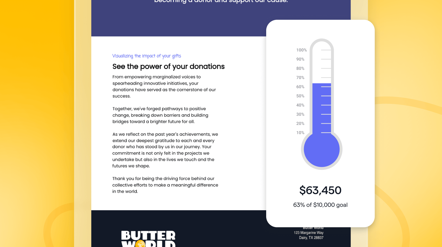
And you have a call to action, that is to give a gift, and that happens through your emails, social media and various types of reports. Storyraise has an integration with Givebutter that can help you create a landing page or a report that says just that. And then, your readers can donate through your Givebutter account right from inside of the report. So there are less clicks for your donors and you can collect the funds, just like you normally would with Givebutter. And then afterwards, you can create a regular report that summarizes that and shows how the gift was spent.
I’m going to share my screen here and give a few examples of best practices that I saw. We’re going to focus on showing impact stories through web-based reports. They’re a little more engaging for donors. A little easier to read. And we’ll also go over some best practices around analyzing metrics, too.
This is a mock impact report made by Givebutter. If I scroll down to the end, you’ll see what the integration looks like, where donors can actually give a gift through this report using Givebutter.
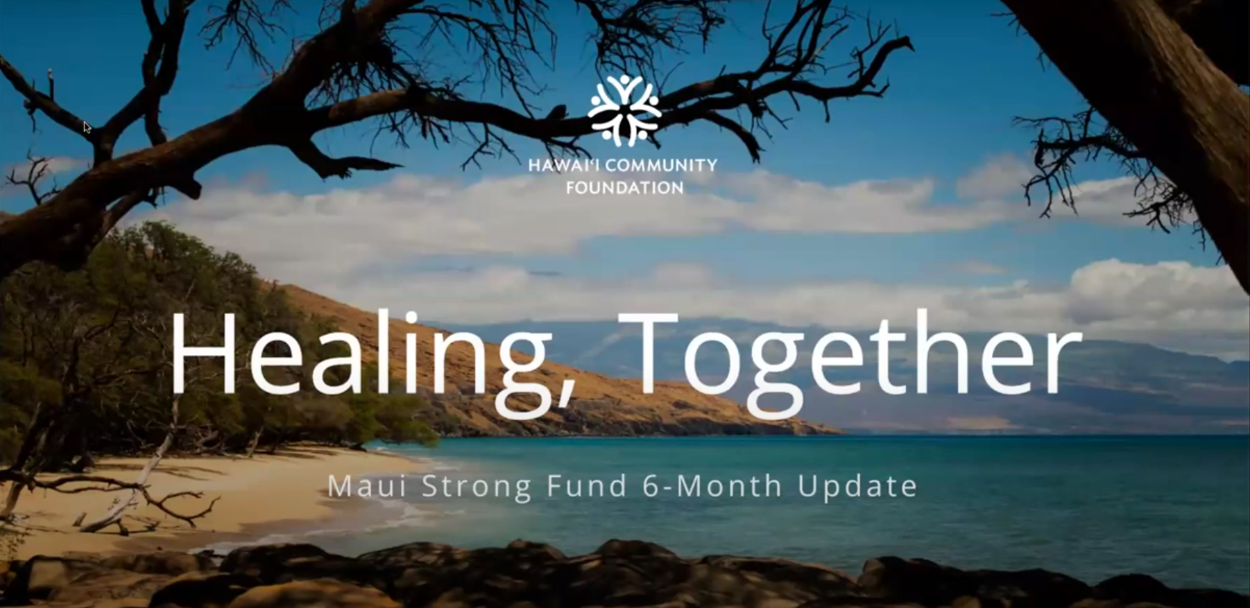
Here’s another report from the Hawaii Community Foundation. I know they’re actually using Givebutter, so it’s a nice example. This is not a report where they’re asking for a gift, it’s just a recap of what happened after Hawaii experienced those fires 13-14 months ago. This report is from the six-month mark. They’ve since created a second report showcasing the developments, but you can also imagine what it would look like if it was part of an ask going beyond the thank you.
This is a nice best practice report because they use a table of contents, a key feature of Storyraise, to keep everything organized. The design is simple. It’s not too text heavy. There’s an introductory letter. They explain what happened, talk about why they need your help and why they have a problem.
I can click from link to link and kind of scroll through, which is really the key benefit of having a web-based report. They tell stories about why it’s important to raise these funds, how the kids and the rest of the community are doing and show how your support is being used.
Claudia Estrella:
I have a quick question. Our customers love templates. Does Storyraise offer templates to help create those end-of-year reports?
Josh Kligman:
Yes, we have a lot of different templates. They range from more common ones, annual reports and impact reports, to solicitation reports or donor reports, which are more one-to-one type reports. You can also use our personalization features to personalize a report for a major donor.
If you’re at any private or independent K-12 school, there’s also endowment reports. That’s a template that can also be used for other types of fund reports or scholarship reports, event recaps, various pitch decks, which could be used for corporate partners or larger proposals.
With our templates, you can create one report and send it out to a thousand different donors or a hundred thousand different donors and everybody gets their own version of the report. Depending on who’s receiving the report, the videos could be different, the stories could be different and you could segment out your audience by giving levels. So gold level donors and silver level donors could get different stories or programs that they’re interested in.
I’ll pull up an example here if you want to see it, Claudia. Here’s a video and a note with a handwritten font that could just be generalized or personalized. It’s a nice way you can use a template to quickly create something like this and send it to one person or your entire CRMs worth of contacts.
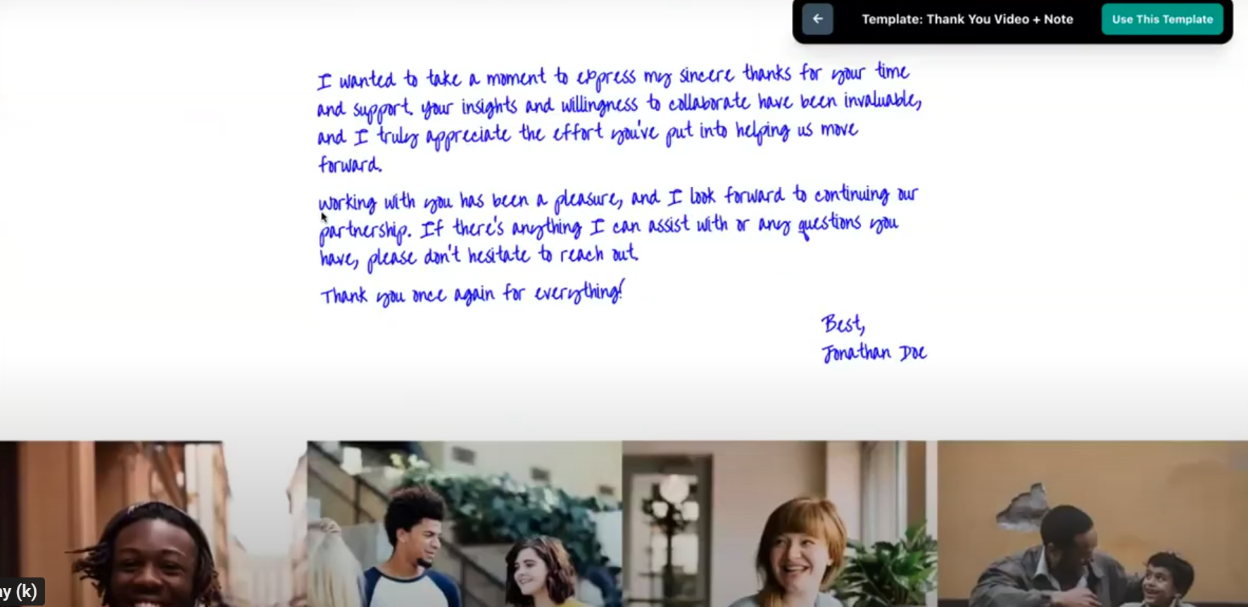
We know community foundations and small schools, religious organizations and a lot of nonprofits want to use a template, get it done quickly and not spend a lot of time creating from scratch.
Claudia Estrella:
Another quick question for you here. How does that personalization work? Do people have to enter the database of individuals they’re trying to reach and then Storyraise pulls their name?
Sabrina Biggers:
Storyraise can integrate with CRM databases and actually pull the data from the CRM. To start, our team would meet with a customer to determine what data they want to communicate between Storyraise and their CRM.
Josh Kligman:
CRM is the best. If you use the free CRM at Givebutter or elsewhere, or you just have a spreadsheet with contacts, it’ll work in Storyraise. So in this example, here’s an impact report that was created for a mock constituent named Sarah. So it says “Dear Sarah,” right? It’s pulling that first name from behind the scenes, when you added “at first name,” which made the name “Sarah” pop in.
And then here, I’ll go to the next section, which is really where the impact story changes. This one report was sent out to all of these different donors. But when Sarah opens it, she finds a specific story tailored to her about a specific program she supports.

I’m going to change this report so it looks like it’s for someone named John, no longer Sarah. Totally different donor. It’ll refresh the page, and it’s going to show the same report that we made, but there’s going to be different content for John. Storyraise dynamically does this. The easiest way to think about that is you may have gold level donors, silver level donors and bronze level donors, and you’re just going to show three different stories to three different audience segments. So I didn’t create anything different. I’m not creating multiple reports, I’m just surfacing different stories.
Claudia Estrella:
Fan girl, I love this. I’m a big advocate for targeting your audiences. I would hate to be a recurring donor and get a message that makes me feel like I’m just a general donor or a one-time donor. I really can’t wait for people who couldn’t join us today to watch this and actually see the power of Storyraise.
Josh Kligman:
Yes! Now we all get personalization from companies, like Spotify. Every year, they do Spotify Wrapped.
Sabrina Biggers:
It shows all sorts of metrics based on your listening throughout the year.
Josh Kligman:
It’s so specific, and it’s sort of the same concept as Storyraise. They’re probably creating one thing, and it’s just filling in the blanks based on specific data that they’re mapping. I know a lot of nonprofits we talked to are creating personalized reports, and I think the best practice is using spreadsheets and mapping the cells and then bringing those over.
You can also turn your digital report into a PDF. There are always some donors who want to print it out. The personalization, even if it’s just someone’s name, it’s another level of showing that you’re paying attention to detail and that you care.
Let’s say you have someone who’s giving $20 a year, and you’re hoping they can move up to that next level of $50 or $100. Most low-level donors are giving to organizations that aren’t giving them that level of attention or stewarding them within webpages or reports.
Josh Kligman:
So we talked a bit about PDFs. PDFs are really hard to read on a cell phone. And that’s one of the reasons why I think web-based reports are a way to meet donors where they’re at. 60% of Storyraise Reports are being opened on mobile devices or tablet devices. So if we want to meet them where they’re at, and we know that we’re competing with their busy schedule (which includes getting interrupted with text messages or whatever else while they’re reading your impact reports), we want it to look nice.
So here’s what the same report would look like on an iPhone. This is a best practice, so check your reports and see if they’re doing these types of things.
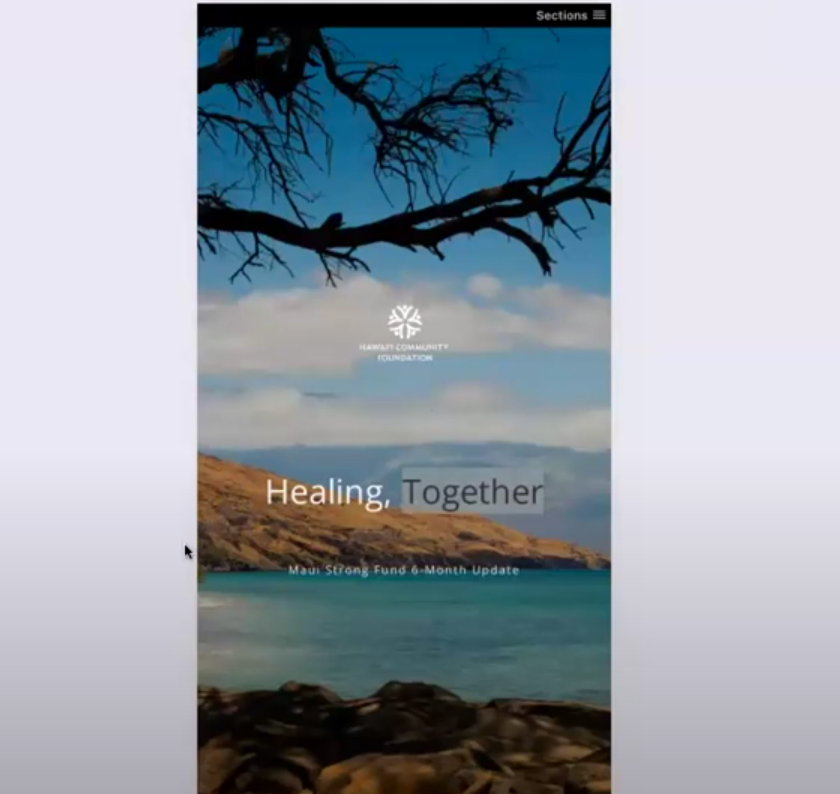
Everything’s stacked. When it’s not stacked, that’s when it becomes hard to read. If it was a traditional PDF, you’d have to zoom in and pinch around to see everything.
So I would just take any PDF that you have or anything that you send out to your donors and just spot check it on your cell phone and see if it looks like it’s clear to read. Because at the end of the day, that’s what’s important. And if you want to know a little trick, if you right click on the screen, I’m in Chrome by the way, it says “Inspect.” Can you see this here?
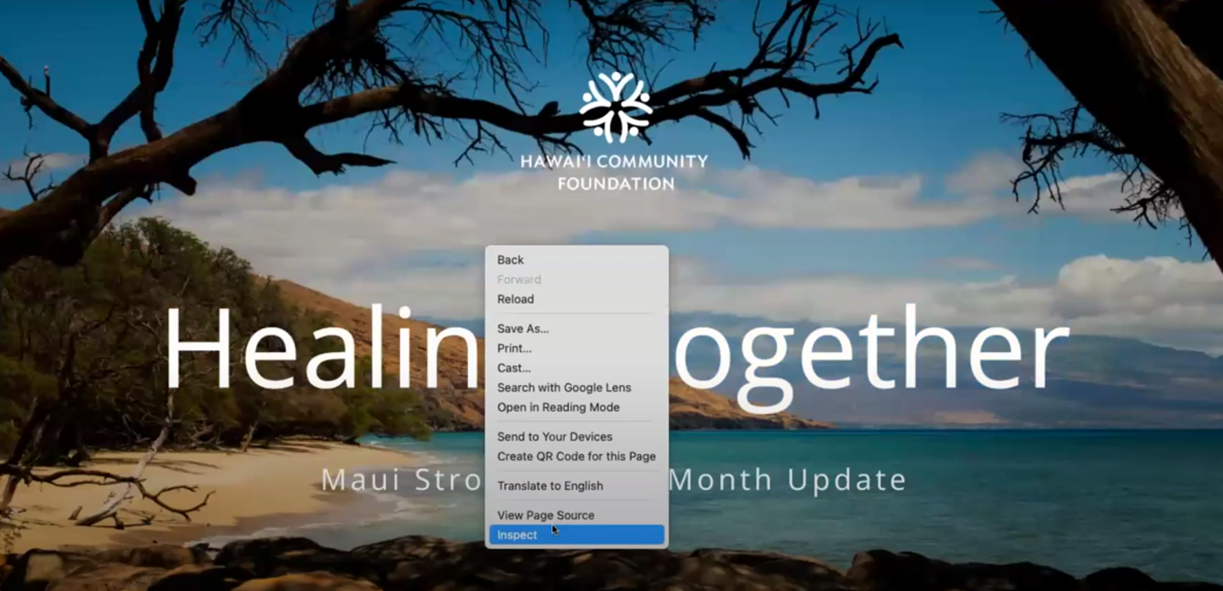
Click “Inspect” and then you’ll see a dropdown here. I can choose iPhone 12, or I’ll choose Samsung Galaxy S III. It shows exactly what it looks like on that device. So you can see all different devices and it’s just a nice way to play around with anything before it goes out to your audience.
Another great storytelling report here comes from a United Way in Indiana, and this shows off how they work using personalization. I showed you a letter before that said dear Sarah, dear John. This personalization is a little more behind the scenes. There are just simple variables that get dropped in and help them tell their story.
But these impact sections are really where it’s at. They’re hyper personalized. So whether that’s done manually or in big buckets for big audience segments, it’s a nice touch. This United Way presents their data in a pretty approachable manner.
Claudia Estrella:
Quick question for you, and hopefully this helps someone. I know a lot of customers may think, “Well, I can just put all this in an email.” Can you help clarify why it’s important to send impact reports? And it’s not just an end-of-year thing, of course, but just the importance of sending impact reports.
Josh Kligman:
I think it’s in the details of the storytelling, and I think that needs a little more space to live within reports and should live in a kind of web-type space. So I have three reasons for that:
1) You have room for storytelling. The details.
2) You can get the metrics behind the stories, you want to know if people are engaging with your content.
3) You can use multimedia. You can embed videos right into web-based reports. A YouTube video just sits there, and people can play it without ever leaving the report. It’s hard to do that with a lot of other sources.
If you’re going to tell a good story, like that playground example I told before, and really cover how you’re impacting the community, you need a little more physical space to do it than an email.
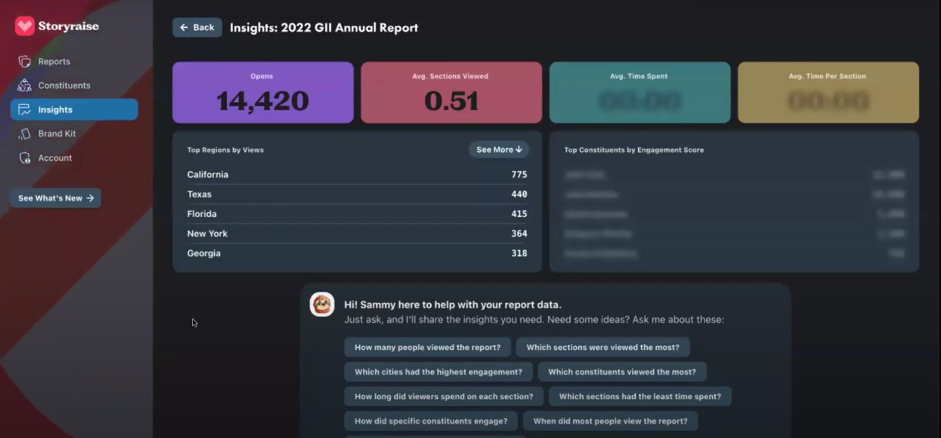
Here are metrics from this Goodwill report, made in Storyraise. You can see how many times people clicked through your eight-section report and how many minutes they spent on each section. We’re working on creating a donor engagement score so we can rank how the donors are engaging specifically with reports.
Claudia Estrella:
So how easy is it to share the reports? Is it just as simple as a link?
Josh Kligman:
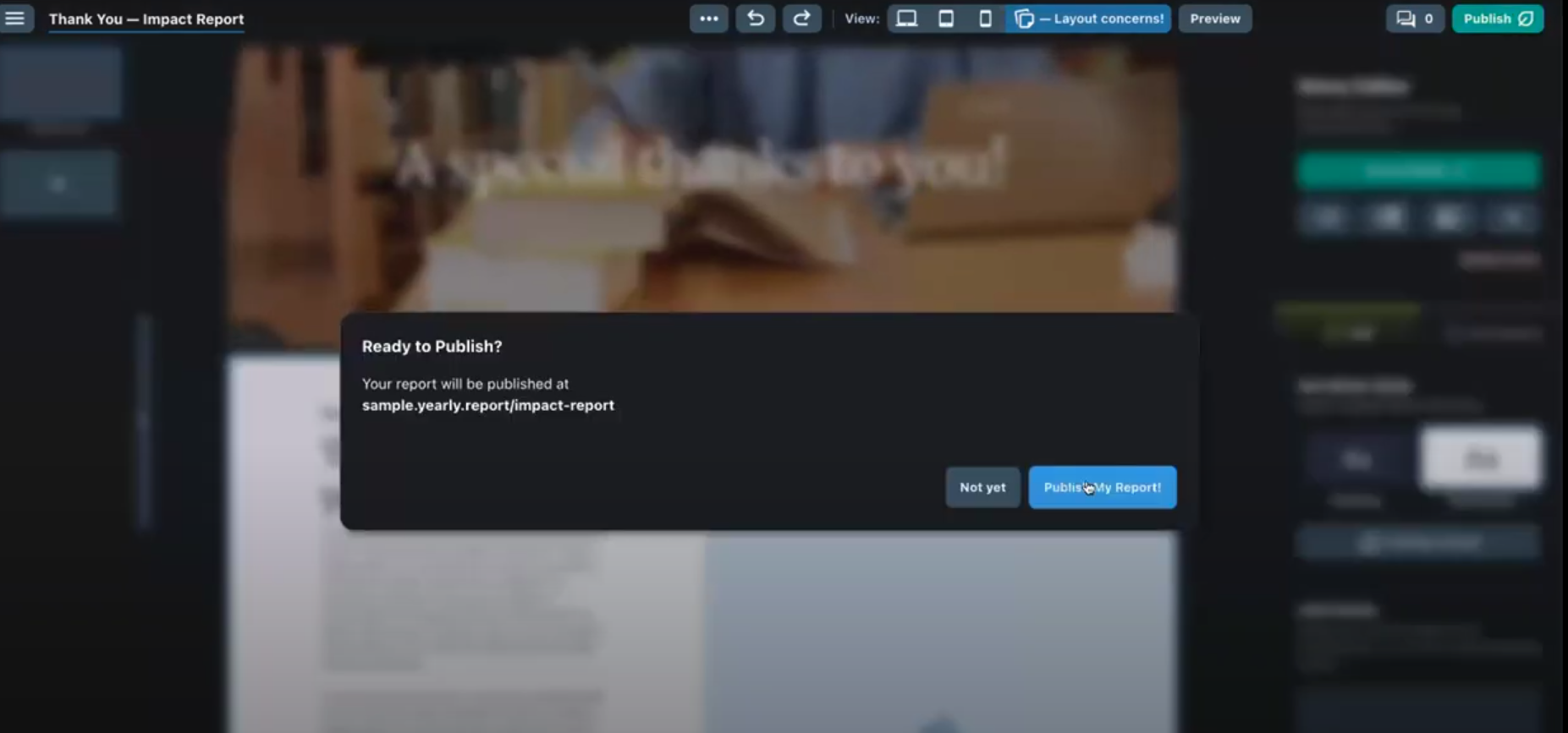
I’m going to pull up a report to show you how easy this is. Here’s a mock report. On the top right of the report builder, I would click the “Publish” page. Then after I click “Publish,” there’s a share button that pops up and it gives a URL. Then, you can go to your email and say, “Hey donors, I created a report. Here it is.” You include the URL, and that’s it. And if you happen to create personalized reports that look different depending on the donor, each person that opens it would see their own version of it.
Claudia Estrella:
I love how simple and easy it is to actually access the reports here. I wonder if you have some best practices on what should be included in an end-of-year giving report specifically and not an end-of-year giving impact report? And then if we’re using Storyraise, I saw that a lot of people had different sections. How would you break up those sections here?
Josh Kligman:
Yeah, I have my own rule of thumb. I’ll show you an example here from American Forests, which is a great organization in Washington, D.C.
1) There are great graphics, which shows how you can take assets you already have and just drop in JPEGs and make things look great, which is what they did here.
2) There’s always some sort of introduction. Usually I see the opening letter as part of it. So you have your intro and then either a letter or a video message from the executive director and it says, “Thanks so much.”
3) Then, you’re going into your programs and weaving in impact stories about your beneficiaries.
4) You may want to include a list of all of your board members, which is nice if you’re going to show this off. But it’s especially nice if you want to show it off to potential partners and they’re like, “Oh, so-and-so is on your board?” And they’re more apt to work with you.
5) A section on volunteers is something that I see sometimes, but not enough. Thank your volunteers. So it’s kind of like an honor roll, but for volunteers. I mean people want to see their names, but it’s probably more important that you show what the volunteers did and show that impact in that section rather than a list of names. And you could have a list of names, but maybe link to it and have it live somewhere else.
Claudia Estrella:
Do you have any recommendations for a report that’s too short or too long? What’s a good middle ground? A length that engages all readers?
Josh Kligman:
I don’t think it can be too short, but it can definitely be too long. The old way of doing it would be thinking about pages and multiples of four because that’s what printers require: 18, 24, 28. Longer than that makes me wonder if people are actually reading it or if it’s a coffee table piece.
You want people to read it, and they may, even if it’s really long. But really long doesn’t mean that it has to be text, text, text, text, text. You can complement text by embedding social media posts or videos next to the story you’re telling. I don’t think it could be too short.
I think disappearing for nine months and waiting for your next annual report would be the worst thing that you could do.
Claudia Estrella:
I want to talk a little bit more about that call-to-action piece and how Givebutter plays into this as well. So as you mentioned, it’s not just an end-of-year report that you’re sending. You definitely want to be engaging your donors throughout the year with these updates, with these reports. And there’s no better way to do it than in a formalized manner. So if you could talk us through what that integration looks like.
Josh Kligman:
This is a mock report that your team at Givebutter created, which is awesome. It’s an impact report. So this is someone that’s saying, “Oh, I started this organization, it’s so great. Here’s what we’re doing. Couldn’t have done it without you.” This is for this time of year when you’re thinking about giving or you’re thinking about capital campaigns and reports where you want to say something beyond thank you.
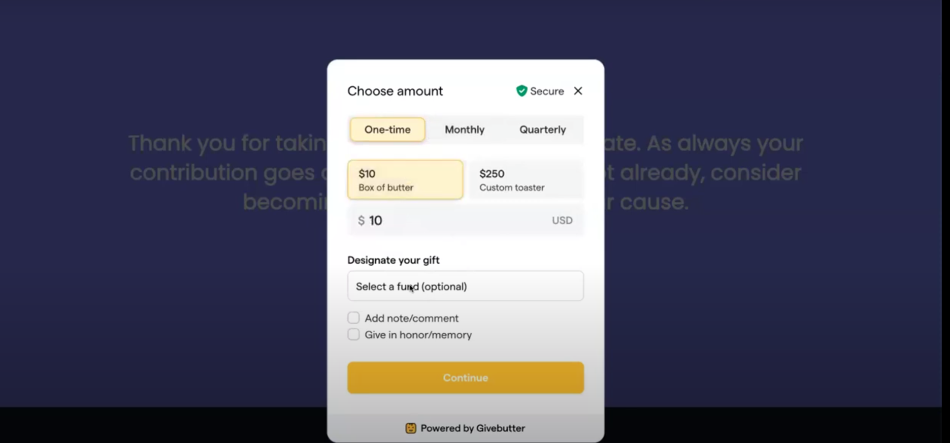
You need to have a call to action that says, “We need you to give.” So thanks to an integration between Storyraise and Givebutter, instead of having a button here that would take you to another page and be an extra click or maybe more for your donors where they then would fill out a donation form, you can have your donors click on the Givebutter donate button.
Then, your existing Givebutter donation form pops up here. So I could say, “All right, I want to give $10 or a box of butter.” Then, I’m going to click “Continue.” I’m just going to confirm. All right, yes, $10, and then click continue. Notice how we haven’t left the Storyraise report page? You can see this is powered by Givebutter and I can go all the way through and pay and then stay on the page. You can still track all that. So that’s what you could do.
I have a tip, you want to hear my tip, Claudia?
Claudia Estrella:
Of course.
Josh Kligman:
Tip is to duplicate or clone your Givebutter donation form specific to the report you’re creating. And then, you can track how much money came from that specific report because otherwise, it’s going to go into the pile of money you have from all of your other elements. So kind of how we talked about segmenting out your audience, break out all of your donation forms in Givebutter so that you can track specific campaigns to specific marketing and communication activities.
Claudia Estrella:
I think this goes way beyond an email, and I definitely want to see our customers using it. Another piece that I think is so important is the branding aspect to it. So I really love that you can reinforce whatever color scheme you’re using, whatever logos you have for your organization, you can make this feel like it’s yours. So shoutout to our marketing team for showing all that butter and that purple in there.
Josh Kligman:
They must’ve just gone into their Storyraise brand kit and then filled it with butter and purple. You could choose your own licensed fonts. There are tons of free fonts available, but if you have brand fonts, you’ll want to use them. You can add your own color swatches by adding in your hex codes. Then, when you create a report, your brand colors will be right there, ready to use.
Claudia Estrella:
Josh, Sabrina, thank you so much for your time today, and we definitely hope to host another office hour session with you all to make sure that other people know about this. It’s really fun just to see all the integration you guys offer, so we really appreciate it.
